The problem
Public EEG machine-learning datasets carry thousands of feature columns across many disorders, with no easy way to compare how each disorder shapes the underlying brainwave bands.
What I built
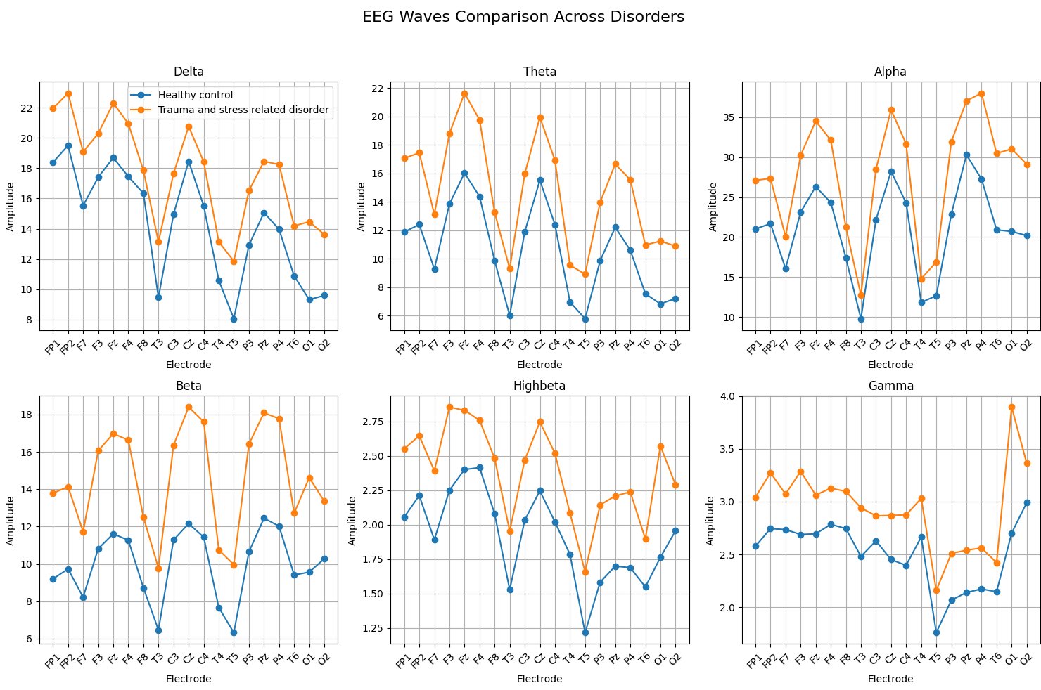
A Tkinter GUI that loads an EEG ML dataset, groups records by diagnosed disorder, and renders a 2 by 3 grid of line charts across six frequency bands (Delta, Theta, Alpha, Beta, High Beta, Gamma) over standard electrode positions. A dropdown switches disorders instantly for band-by-band comparison.
The outcome
Turns an opaque ML dataset into a tool a neuroscientist or clinician can actually read. Demonstrates feature-column mapping to electrode positions and signal-band visualization on real neurodiagnostic data.
Interested in this kind of work? Get in touch